
JSTOR Daily
Redesigning JSTOR Daily's most-visited pages to improve retention, discovery, and accessibility across 700k+ monthly users.
Overview
JSTOR Daily is a daily news site rooted in research that bridges scholarly work and general audiences. Over nine months, I worked as a UX designer and researcher on a team of five to redesign the platform's core experience. I owned the article page redesign across desktop and mobile, co-authored the user survey, and conducted a fifth of the 20+ hours of user interviews. The scope covered both short-term improvements to the existing interface and long-term recommendations for the product roadmap.
The problem
The platform's existing structure made it difficult for users to find what they were looking for. Users were navigating fragmented article collections and disconnected pages, often unable to find the content they wanted to see. The navigation was unintuitive, search was buried, and there was no clear path from discovery to reading. These friction points were driving users away from the content rather than deeper into it. Additionally, JSTOR wanted to use this daily news site to bring more users onto their main research database, JSTOR.org, and had no clear connector.
Research
The team conducted a thorough analysis of the existing platform using both quantitative and qualitative data. We surveyed 240+ users and conducted over 20 hours of interviews across the platform's full user spectrum: researchers, educators, students, and librarians. Each group used the platform differently, which meant any solution needed to serve fundamentally different workflows without adding complexity.
The research surfaced consistent themes. Users struggled with discoverability: finding the right page, understanding what content existed, and navigating between related articles. The search bar was hidden in the navigation, and there were no contextual links between related pieces of content. An accessibility audit also revealed missing alt text, improper heading structure, and screenreader issues that were preventing users with assistive technologies from navigating the site effectively.
Process
With the research findings as a foundation, we moved into defining the problem clearly before jumping into solutions. The platform serves drastically different user types, so we needed to prioritize improvements that would have the broadest impact rather than optimizing for a single workflow.
The process was iterative: ideating, prototyping, testing, revising, and repeating. We mapped the information architecture to understand the full scope of the site, then identified the specific pages and interactions where improvements would have the most impact. Not everything was polished at each stage, but it was important to see how the experience evolved with each round of feedback.
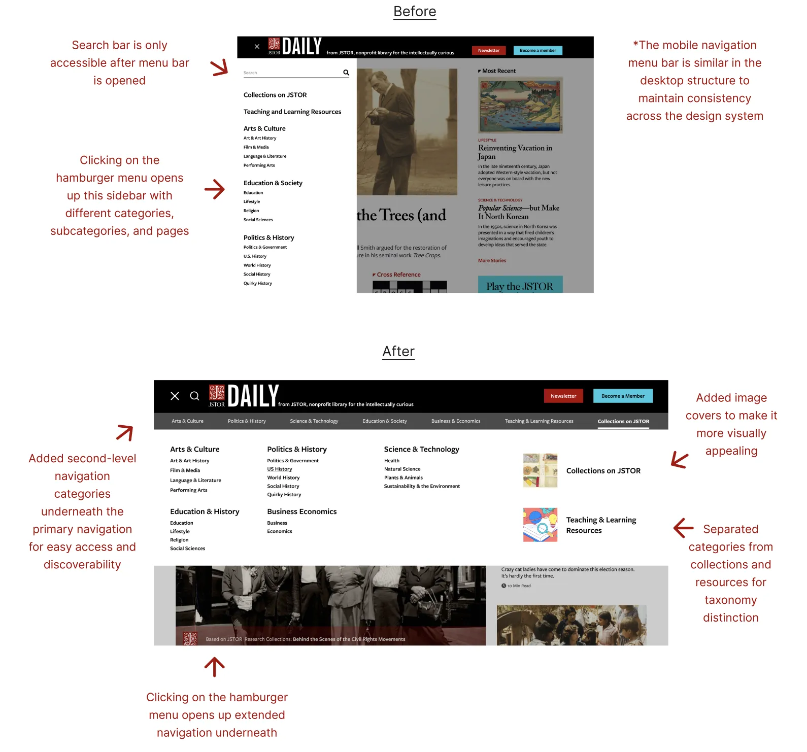
A persistent challenge was the difficulty users had finding the right page for their needs. The search bar was hidden within the navigation, and there were no clear wayfinding cues to help users orient themselves within the site's structure.
Solutions
Through extensive testing and iteration, we developed three core improvements that addressed the most critical pain points from the research.
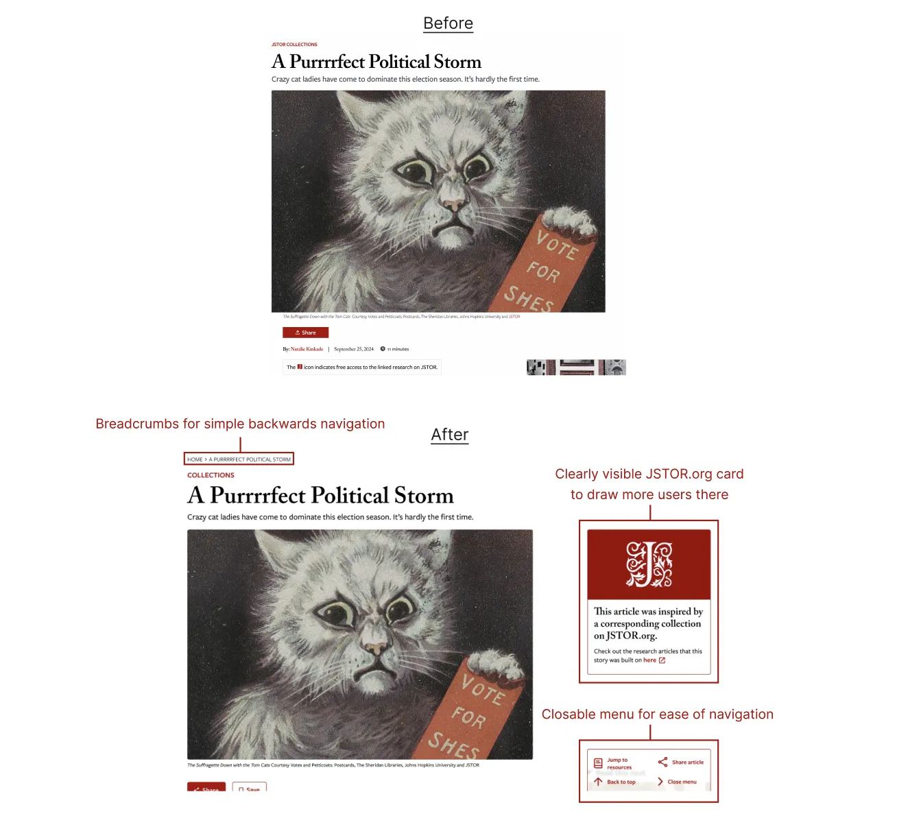
Streamlined navigation We restructured the information architecture so users could understand where they were and where they could go next. Search was elevated from a hidden corner to a central, accessible location on every page. Breadcrumbs were added to give users a visual trail back through their journey without losing context. After the redesign, users found items in the navbar in 9 seconds on average, down from 124.
Inline references We introduced article previews on hover so users could understand content before committing to it. Inline citations and references created pathways to explore deeper into topics, and thematic collections helped casual readers find their way into specialized subjects without prior knowledge, with the added benefit of drawing more attention to JSTOR.org.
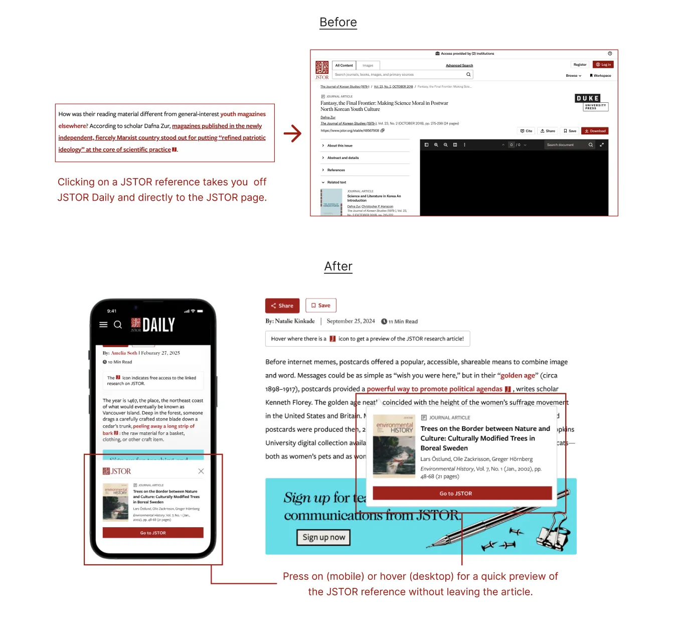
Article page improvements The article page was restructured to keep readers oriented and connected to the underlying research. Breadcrumbs were added for clear wayfinding, and a JSTOR collection card surfaces the original research behind each article found on JSTOR.org. I also designed a collapsible tool hub that sits in the corner of the article page, giving readers quick access to sharing, navigation, and related resources without leaving their reading position. Through user testing, we iterated from a fixed sidebar that obscured content to a semi-transparent, closable menu that stays out of the way until needed. Users found resources in 10 seconds on average, down from 61, with task completion times across article page interactions improving by over 80%.
Beyond
The engagement spanned nine months, but the work is ongoing. We delivered a final report with both short-term improvements and long-term recommendations for the product roadmap, including our research-backed design recommendations, implementation details, and success metrics, with the expectation that the team would continue iterating based on user feedback.