hundred and one
Leading end-to-end design and development of a headless e-commerce storefront, from stakeholder discovery and visual design through production build with Next.js and Shopify.
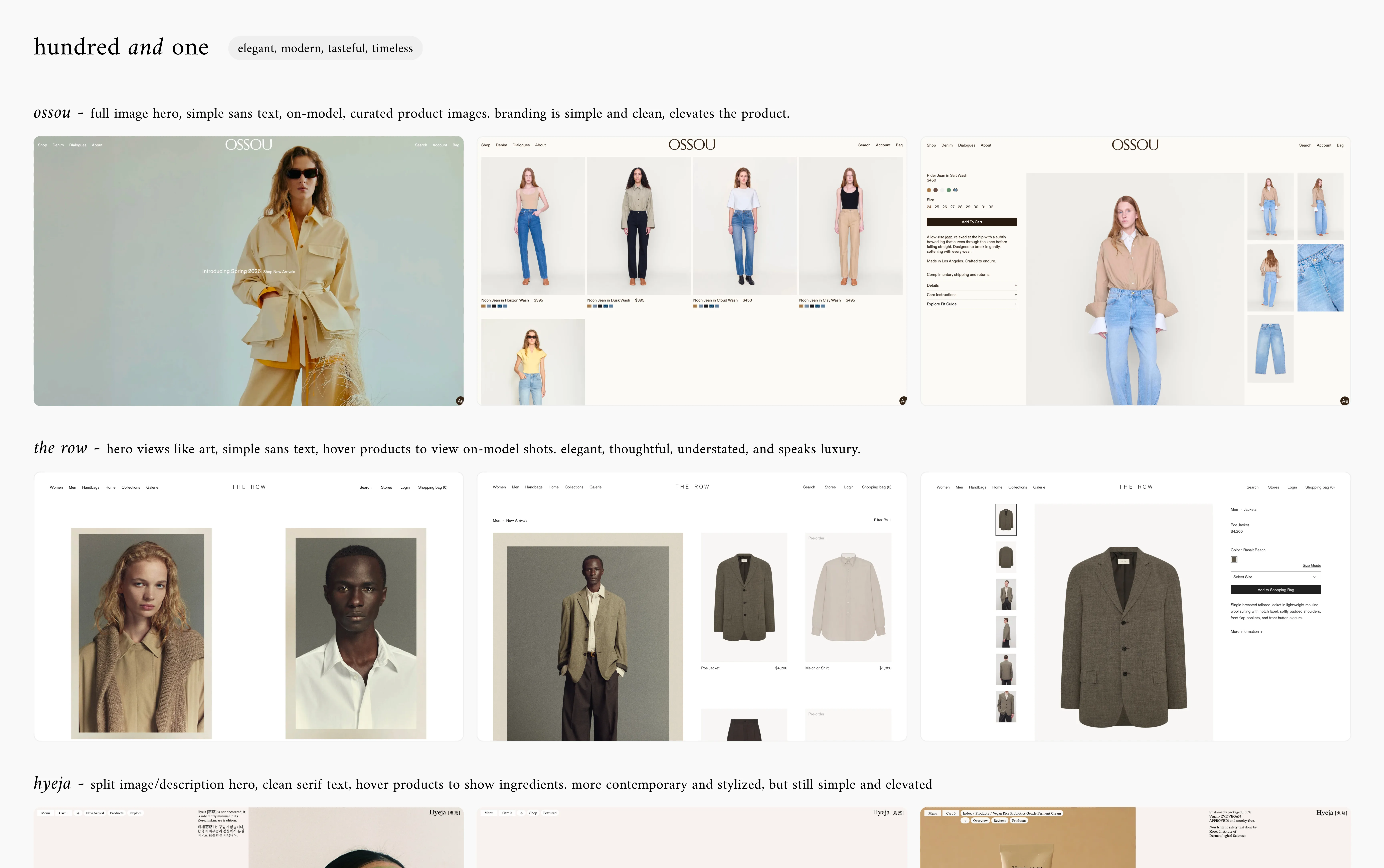
The brief
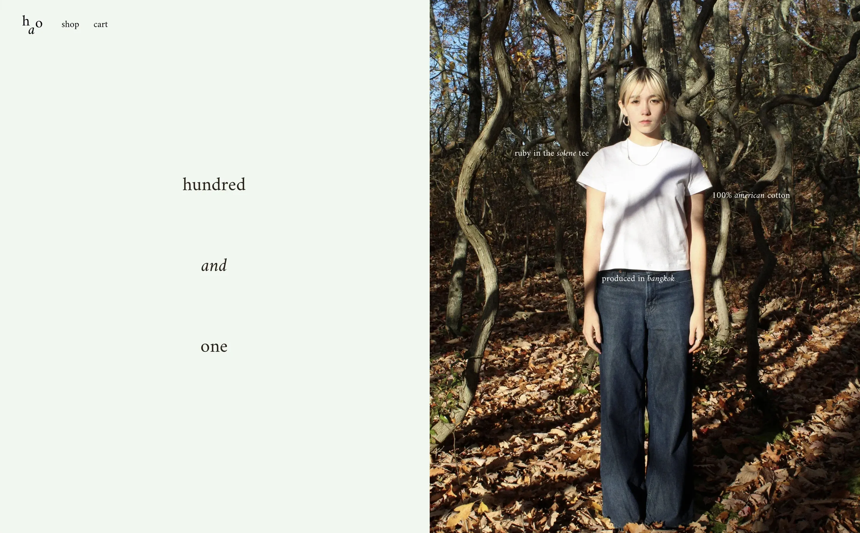
hundred and one is a new clothing brand rooted in authenticity, for those seeking the perfect basics: American cotton essentials, transparent sourcing, and quality that punches above its price. The brand needed a digital presence that matched that ethos: refined, deliberate, and expressive.
Research and direction
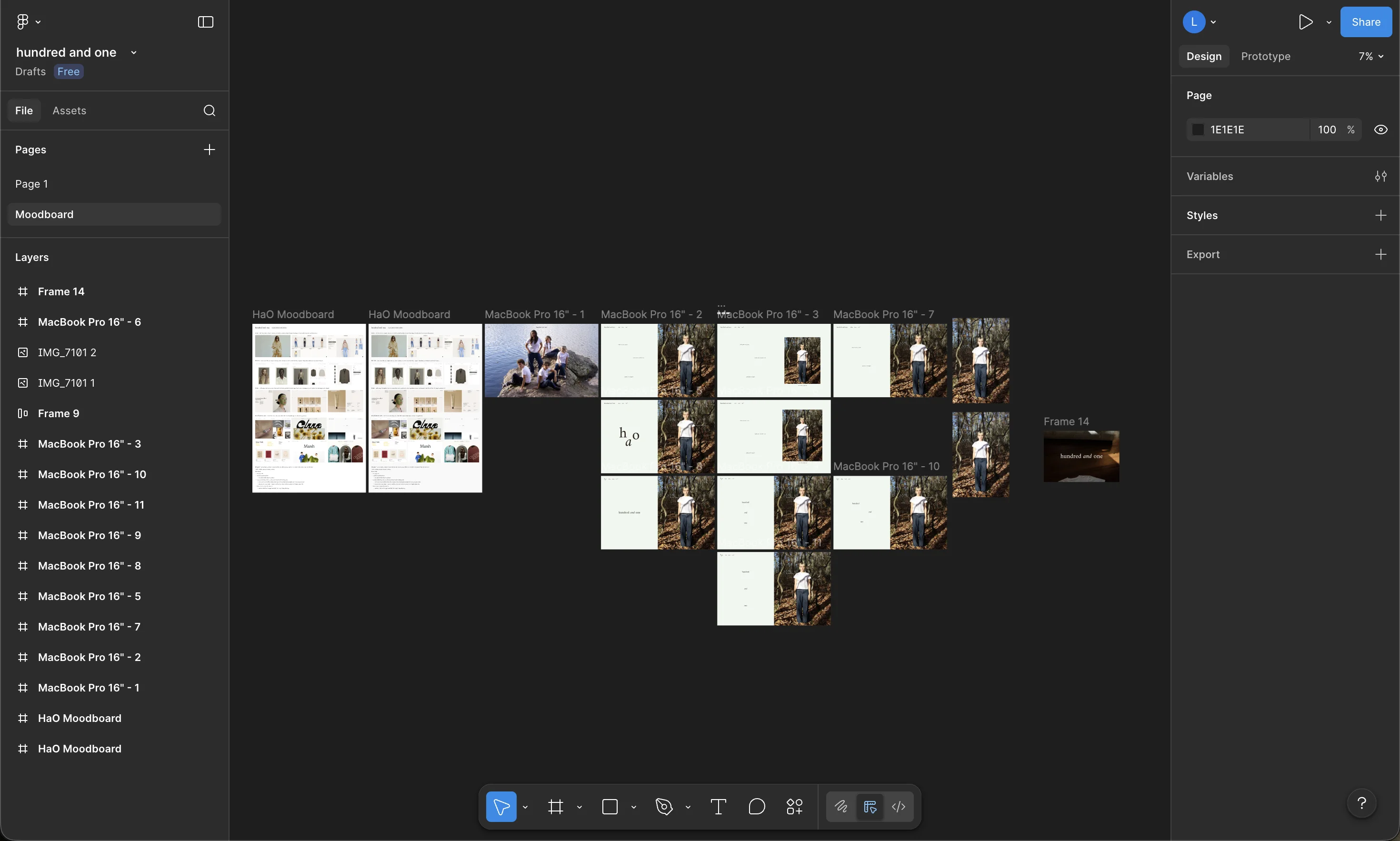
The engagement began with interviewing the founders to define the brand's positioning and visual identity, followed by a competitive analysis of other apparel brands to identify conventions worth adopting and opportunities for differentiation. From that research, I assembled a moodboard spanning typography, photography, color, and layout references. We aligned on a creative direction through that artifact: an editorial sensibility grounded in natural tones and generous whitespace, showcasing the thoughtfulness of the brand and emphasizing the quality of the product.
Visual design
I started by designing the homepage in Figma, establishing a visual language built on the Amiri typeface, a sage and bark color system, and a consistent spacing scale. Multiple layout directions were explored, including full-bleed hero compositions, asymmetric editorial grids, and split-panel structures, before arriving at a direction the founders felt represented the brand.
Design to code
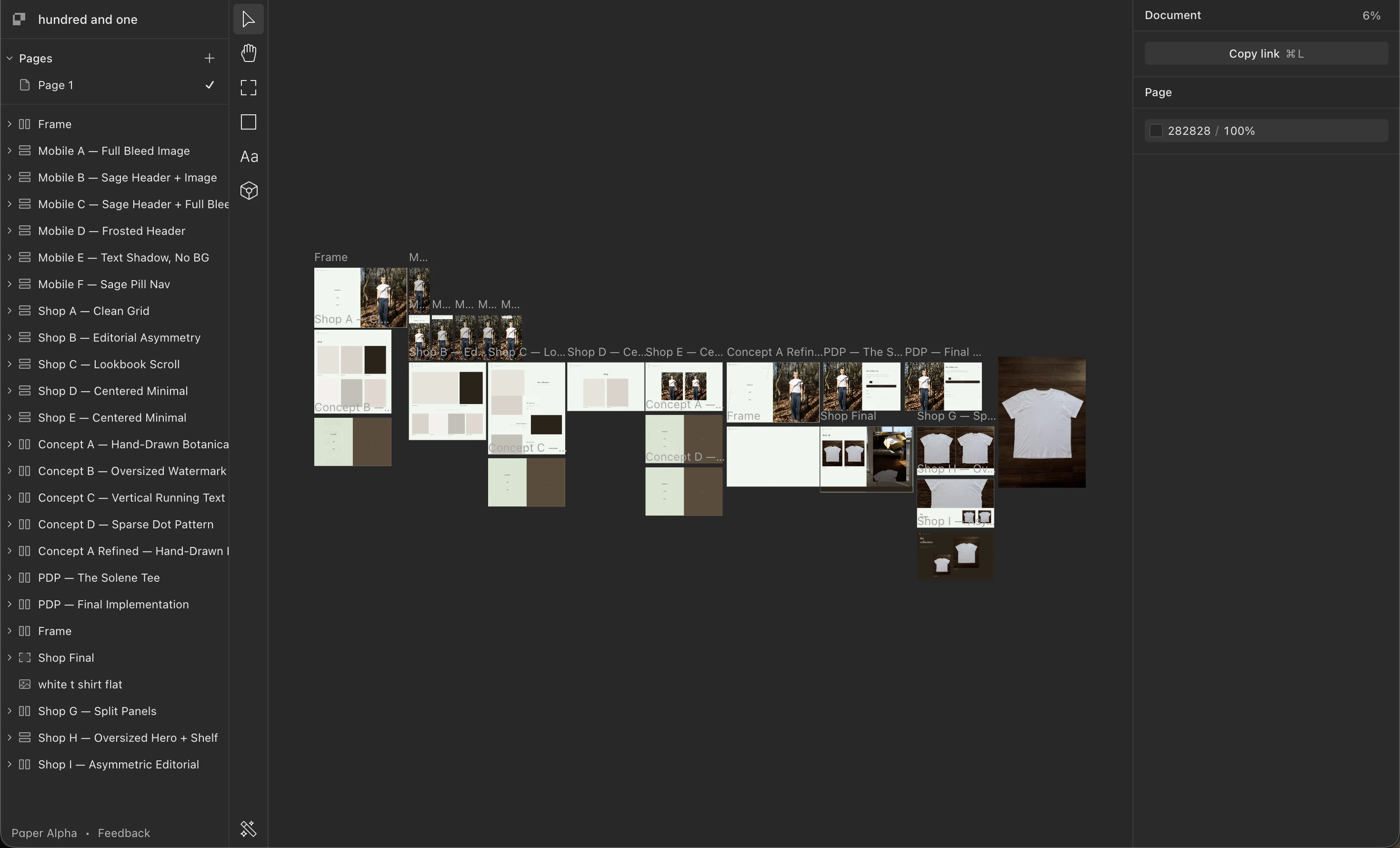
With the homepage direction locked and tight timeline in mind, I transitioned into Paper, a design tool with an MCP integration that let me move between design exploration and production code without context switching. The remaining pages were designed and built in this environment. Rather than handing off static mockups, I could prototype layout variations and immediately translate decisions into working components, collapsing what would typically be separate phases into a single workflow.
Implementation
The production site is built with Next.js and Tailwind CSS, running as a headless storefront with Shopify managing inventory, checkout, and order fulfillment via the Storefront API. Product data is server-rendered for performance, while the cart operates client-side with optimistic UI updates.
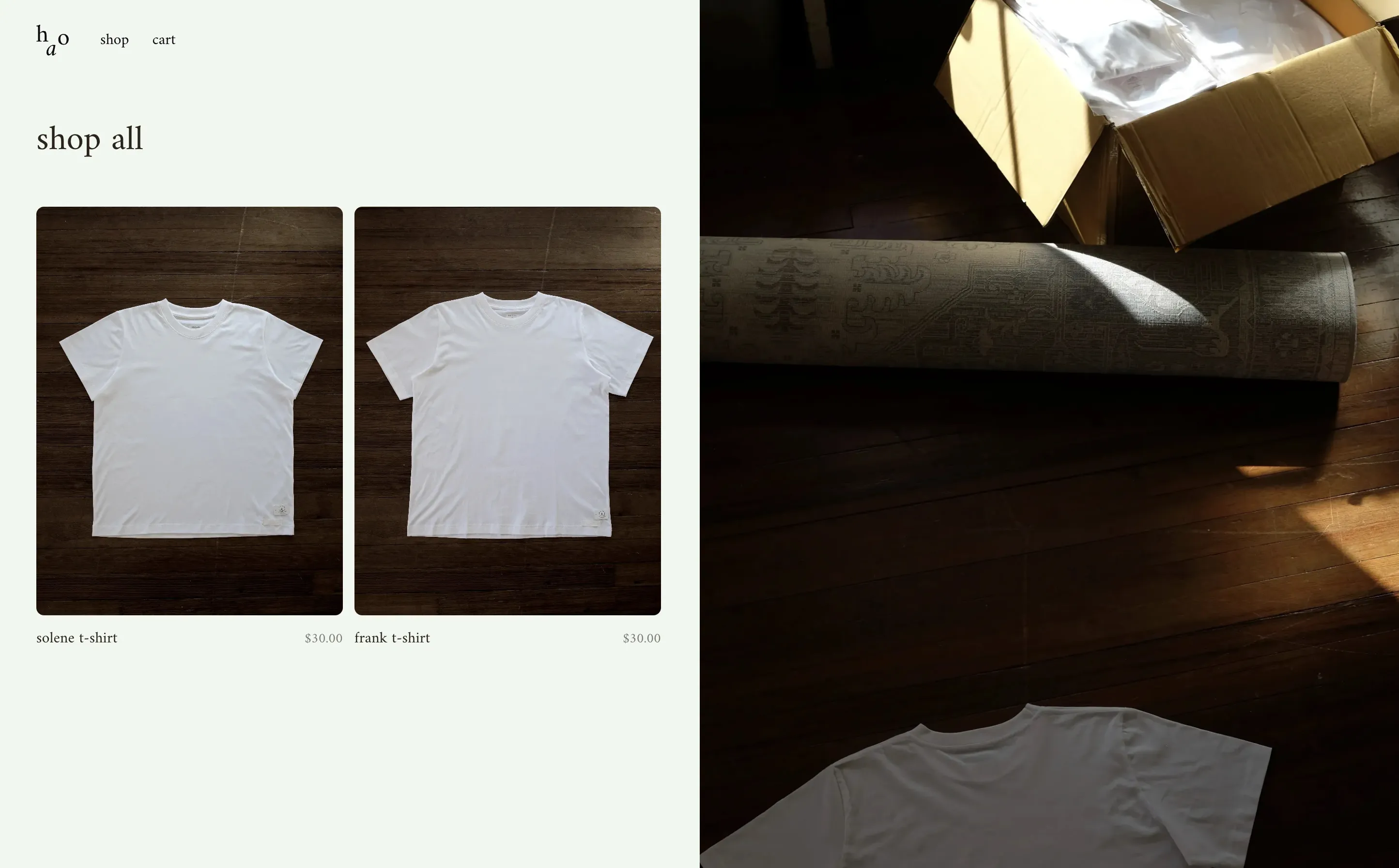
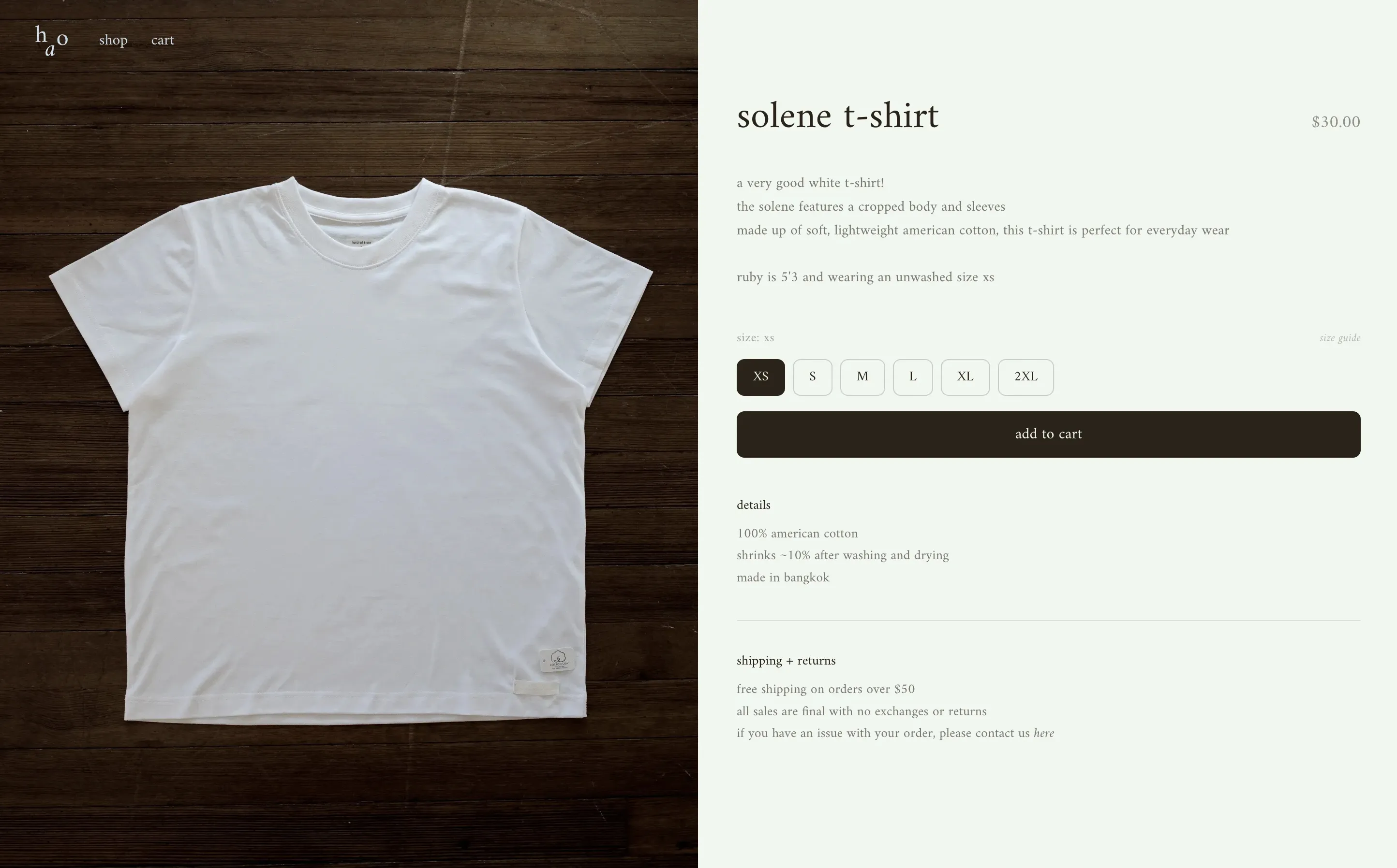
Key design decisions carried through to implementation: the homepage layers typographic annotations directly onto the hero photography using an SVG composite. The shop page uses a split layout with product cards on the left and a full-height editorial image on the right, giving the page a more refined feel without overcomplicating the browsing experience. The product detail page mirrors that asymmetry with scrollable product imagery against a sticky information panel.
Visit the site here.